
So, you’re ready to take the jump and create a website for yourself, your business, or something else you adore—but you have no idea how to do it? Do you want to push your client’s website to dizzying new heights in terms of traffic? Do you want to add some stunning web design to your online design portfolio? We’re here to assist you! Check out our collection of 26 essential website design suggestions to improve the appearance and feel of your site and encourage more visitors to click! Let’s get started.
Begin by making a rough sketch.
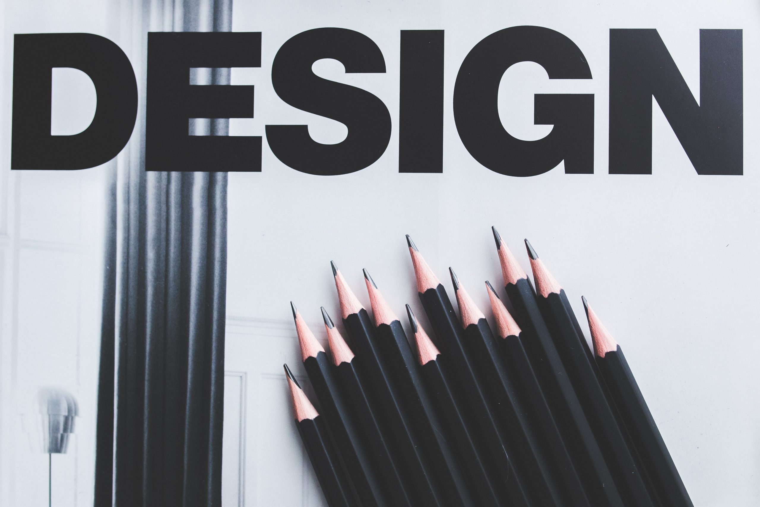
Code is rarely the starting point for good web designer. Jumping immediately into the project’s meat is actually harmful to the eventual product! Instead, you should begin wireframing your design.
Draw a rough plan for your website design on a piece of paper with a pen (pencil is best because it can be erased). Before you start designing anything in a digital realm, figure out where you want pieces to go. You might think it’s counterintuitive, but you’d be wrong: design thinking is critical to your page’s success. It can help you improve the outcomes of any creative endeavor you work on if you use it in your planning.
Keep the speed of the load in mind.
You’re on a website, and it’s taking an eternity to load anything. Serving data to your users quickly is an important part of good website design. If each image takes three minutes to load, no one will stick around.
So, how can you keep the loading time to a manageable level? The right host for your website might make all the difference. Are you short on time? Choose a website builder that is simple to use and prioritizes loading speed.
Next, make sure your website design keeps huge objects to a minimum. The quantity of images or videos you display (especially at higher resolutions) can have a significant impact on how long it takes for each user of your site to download that material.
 Consider mobile first.
This is possibly the most crucial of all the website design recommendations in this post. When it comes to modern website design, a responsive, mobile-ready page is a must. Mobile devices now account for more than half of all web traffic! Make sure that every piece of your site is responsive and will display properly in any resolution. You should also select a platform that optimizes your photographs for mobile viewing.
There’s a lot more to it, but we’ll leave it up to you to investigate the various ways in which mobile design can be employed successfully on your page.
Learn a little about UI/UX design.
One thing is certain: a positive user experience will attract visitors and make a significant impact in the design of your website. If consumers find your site to be simple to use and navigate, as well as visually appealing, you’re on your way to a lot of clicks and views (and sweet, sweet income!). Check out our guide on how to become a great UX designer for more advice on how to improve your user experience.
Establish a Visual Hierarchy
It’s crucial to consider where you put things on your website design. Humans are visual creatures, so presenting information in a way that they can understand is crucial to capturing their attention and ensuring that they retain the information you’re giving them.
If you put a large video at the top of a website, for example, you can be sure that every visitor will view it. But what if you put a 12-point font “purchase now” link underneath it? There’s a good chance they won’t even notice the link. When we read, our eyes naturally follow a path, and you want to guide them with well-placed content by leading their eyes in a natural way.
Look for headlines that work for you.
One of the most useful website design hints we can provide? Don’t undervalue the impact of a strong headline or subhead. They can engage consumers without relying on flashy images or video files to do so. A headline or subhead that is badly written is a squandered opportunity to pique interest.
Make that your headline is descriptive. “Signature Lipsticks Delivered To Your Door,” for example, is considerably more effective than “Get Our Specialty Product.” It explains exactly what you’re selling and how you’ll get it to them! Not only does it make it clearer to the user what the area is about, but it can also help you enhance your SEO score significantly.
Hick’s Law is a psychological concept that argues that the more options provided to an individual, the longer it will take them to make a decision. Thanks to a few psychological tactics, this can be exploited to your advantage in website design, allowing you to maximize conversion rates. (When you convert viewers into customers, this is referred to as conversions.) Trim down the content on your site and present simply the bare minimum essential to get your point across, rather than inundating the user with a plethora of options. That is excellent web design!
Take a look at Twitter or Facebook to see how Hick’s Law can work in your favor…and bring in a lot of money. You can’t think of any ways to make your page smaller? You might want to consider the following options:
- Reduce the number of objectives on each page to one.
- Don’t put icons on your page for items you don’t use very often (why put Twitter on your page if you only use it once a year?).
- Make the forms as straightforward as possible.
- Reduce the number of selections on your menu.
- Reduce the number of possibilities available for sale from 500 to 50. Offer your products in cycles to add to the feeling of scarcity and make them more appealing to purchase.
The Fold is to be avoided.
This is one of the most significant website design guidelines to keep in mind. Before a visitor needs scroll, the fold is the first glimpse of a website. It could be the most crucial aspect of your website’s overall design.
Make sure your headline and any relevant calls to action (CTAs) are contained within this sector, as this is the first location where you’ll be able to create clicks (and thus traffic), so make the most of it! (By the way, a call to action is a piece of text that is intended to motivate the viewer to take action—ideally, to buy.)
The CTAs should be spaced out.
Additional CTAs should be included elsewhere on the page in a good website design; not every visitor will act right away. Your goal is to persuade them to make a decision, which frequently occurs outside of the fold. If you have a button for them to click above the fold, you should provide the same action in at least one additional spot on the page after the fold, as a general rule.
Remember, the taller you are, the better.
If you have a lot of information to give to visitors, you’ll need a lot of room in your website design to accommodate it. Putting all of these facts on a long scrolling page can actually help you a lot more than you might think. There have been studies that demonstrate that when there is more data to scroll past, conversion rates improve by up to 30%.
Maintain a straightforward approach.
You want your material to be well-liked by your audience. However, you must avoid inundating them with information. Knowing what to show visitors is an important part of website design. Focus on the principle of less is more, and give them one detail at a time. Sell them a single book, not a series. Allow visitors to find and investigate each item on their own by giving it personalized attention. They’ll be more involved, and so more inclined to make a choice.
The more straightforward your website is, the better it will function. Complexity terrifies me!
 Take Advantage of White Space
Clutter irritates people. What does this entail for the design of your website? Make use of white space. Padding between paragraphs allows your text to breathe and makes it easier to read. It’s one of the driving forces behind the current trend of bigger webpages with single-column layouts, and it’s a terrific way to efficiently generate visitors.
Standards Must Not Be Ignored
On the internet, there is a lot of repetition. Standards are important in web design because they work. A site’s attraction decreases as it grows increasingly aesthetically complicated. People are turned off by strange and odd layouts since they have no notion how to interact with your website design. Instead of trying to reinvent the wheel and losing viewers, use standards to your advantage and create imaginatively within that space.
Use people’s photos
You boost your site’s conversion potential the moment you add original, high-quality photography. This is especially true when the subject is a person rather than an object or a location. To add polish, get some high-quality photographs taken for you (or take them yourself) and use them as full-screen background images. You’ll notice a large spike in clicks (and purchases!) very quickly. If you’re on a budget, stick to stock photography companies that provide high-quality, natural-looking pictures to avoid the artificial look that many stock photos have.
Make use of visual cues in your photographs.
You may dramatically increase the quality and functionality of your website designs by enhancing your photos. Consider utilizing a photo of a person glancing gradually toward your call to action instead of a photo of a person staring straight ahead at the visitor. These clever photo juxtapositions have the potential to increase your conversion rates.
Be Careful With Your Links
So you’ve finished your best website design to date and are ready to start adding content links? Be cautious about where you put them and how they work. Place no links on your site that will divert visitors’ attention away from yours. Place no links that would lead them to places where they will become lost (such as Facebook or Pinterest). If you must include links, make sure they are relevant to your website and not a distraction.
False Bottoms Should Be Avoided
When you use a dark background for a single section, readers will assume it’s a footer. This is referred as as a false bottom by web designers, and it is not acceptable web design. If they think it’s a footer, they’ll stop looking at your page (or worse, leave!).
If you must have full-screen parts in the center of scrolled areas on your page, make sure they aren’t excessively dark in comparison to the main content and that they engage the user.
Carousels are a thing of the past.
Don’t get too caught up in image sliders and carousels. It’s bad practice because most people simply see the first image and disregard the rest. Instead of using a full-page hero picture or stacking photos vertically, we propose using a full-page hero image or stacking images vertically to entice visitors to scroll farther down your website (thus increasing your conversion rate in the process).
Reduce the number of tabs
Tabs are an unappealing site feature in general. Most of us skim stuff, and let’s face it, you’ve probably visited websites before without even realizing they had tabs. They usually serve little purpose other than to conceal information. Bring hidden content to the foreground of a page’s scrolling content. It’s not only good web design, but it also gets users to interact with your data.
Remove the Header’s Social Icons
When learning how to design a website, you might be startled to hear that putting social media icons in the header is actually bad practice. When you put icons up there, you’re luring consumers away from your site and into social media!
Worse, if you don’t post to the sites you link to on a regular basis, the visitor won’t obtain the most up-to-date information and will quickly lose interest in what you have to offer. Icons should be placed in the bottom rather than the header.
 Slang and jargon should be eliminated.
When you bombard visitors with industry jargon, you risk sounding like an ad and scaring them away. Good web design is all about using simple terms that everyone can comprehend; if you focus on maintaining that reading level, you’ll see a significant improvement in usability. Customers, not a board of directors, are the ones you’re courting.
Put Text to Work for You
You’re only half-right if you believe “people don’t want all that detail.” While you should avoid bombarding visitors with walls of text, your website design should allow for detailed descriptions of your products and services. Subtitles beneath photographs, for example, can inform visitors about what they’re looking at.
Take into account the order of the list.
Pay particular attention to how lists are presented when inserting them into material. When it comes to lists, web designers know that the most significant information should always be at the top and bottom of the list. Those in the middle are the least noticeable and, as a result, are the least read. It’s a small detail, but it can have a big impact on how much information sticks.
Logos should be placed on the left.
Because the first thing a consumer needs to see is your identification, it is normal web design practice to place a logo in the top left or top-center. A well-designed, highly visible logo guarantees that the brand sticks in the minds of visitors.
Respond to customer inquiries.
You can be sure that people will ask inquiries. Make sure your website design contains a section where customers may ask questions (such as a FAQ) or a contact form where they can contact you directly.
Wins are shared.
Is there any feedback or remarks from actual users on the service or product? Share it with the rest of the world! Customer testimonials should be incorporated into your website design. It will offer customers the impression that this company is well-regarded, and that using its services is a good investment of their time and money.
Simplify the registration forms
Nobody on the globe like filling out a long registration form. If you must include a signup form in your website design, make it as brief as feasible. Done with the email, username, and password. Give them three to four fields to worry about in the best case scenario. You rarely need more than this, and the lack of headaches will raise conversions by a factor of ten.
Display Your Work
You may start creating remarkable sites that draw in droves of visitors now that you know how to create a website and have some handy advice on what distinguishes good web design from bad! It’s critical to put your greatest website designs on display in your online portfolio. You don’t have one yet? Create a great portfolio website in minutes using an online portfolio website builder. Choose one that offers a free trial to ensure that it has all of the bells and whistles you require, as well as some cool templates that complement your brand.
Other fun features to look for are an integrated blog (so you can share your best web design insights with your community) and a mobile app (so you can update your portfolio on the fly).